Cross-Browser Inline-Block

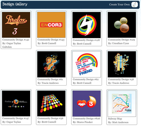
Ah, inline-block, that elusive and oh so tempting display declaration that promises so much, yet delivers so little. Too many times have I received PSD files like this:

Gallery Design

and begin to cry.

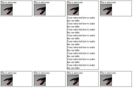
Normally, this type of layout would be a cakewalk. Fixed width, fixed height, float:left and you’re done. Buuuuut, the design needs to work with variable amounts of content, which means if one of these blocks has more content than the others, it will break the layout:
Broken Layout with float:left

Because the first gallery item is taller than the rest, the 5th item is floated left against it instead of below it. Basically we want a layout with the flexibility of a table, but proper, semantic markup.

We start with a simple page with an unordered list and display set to inline-block:

<ul>
    <li>
        <h4>This is awesome</h4>
        <img src="http://farm4.static.flickr.com/3623/3279671785_d1f2e665b6_s.jpg"
        alt="lobster" width="75" height="75"/>
    </li>
...
<ul>

<style>
    li {
        width: 200px;
        min-height: 250px;
        border: 1px solid #000;
        display: inline-block;
        margin: 5px;
    }
</style>

And it looks ok in Firefox 3, Safari 3 and Opera:
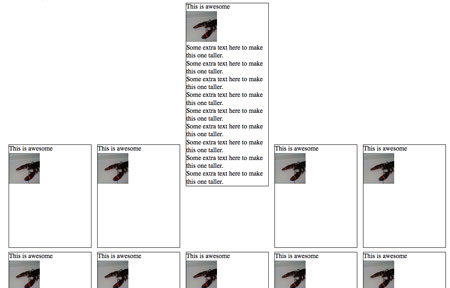
Step 1

Obviously, something is wrong with the vertical alignment. Well, not exactly wrong, because this is the correct behavior, but it’s not what we want.

What’s going on here is the baseline of each <li> is being aligned with the baseline of the parent <ul>. What’s a baseline, you ask? A picture is worth a thousand words:

Baseline

The baseline is the black line running through the text above. Putting it as simply as possible, the default vertical-align value on inline or inline-block element is baseline, which means the element’s baseline will be aligned with its parent’s baseline. Here’s the first inline-block attempt with baselines shown:
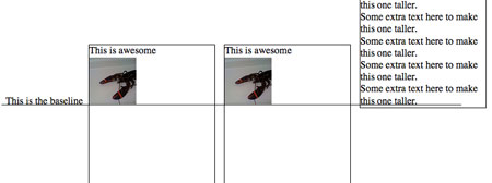
Baseline illustration

As you can see, each baseline is aligned with the baseline for the text ‘This is the baseline’. That text is not in a <li>, but simply a text node of the parent <ul>, to illustrate where the parent’s baseline is.

Anyway, the fix for this is simple: vertical-align:top, which results in a great looking grid:
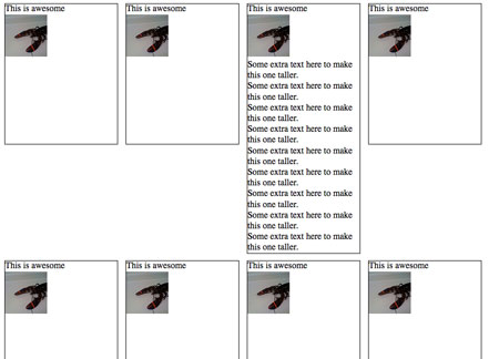
Inline block 2

Except it still doesn’t work in Firefox 2, IE 6 and 7.
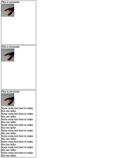
inline-block-ff2

Let’s start with Firefox 2.

Firefox 2 doesn’t support inline-block, but it does support a Mozilla specific display property ‘-moz-inline-stack’, which displays just like inline-block. And when we add it before display:inline-block, FF2 ignores that declaration and keeps -moz-inline-stack because it doesn’t support inline-block. Browsers that support inline-block will use it and ignore previous display property.

<style>
    li {
        width: 200px;
        min-height: 250px;
        border: 1px solid #000;
        display: -moz-inline-stack;
        display: inline-block;
        vertical-align: top;
        margin: 5px;
    }
</style>

Unfortunately, it has a small bug:
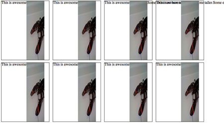
Inline Block in Firefox 2

Honestly, I don’t know what causes this bug. But there is quick fix. Wrap everything inside the <li> with a <div>.

<li>
        <div>
            <h4>This is awesome</h4>
            <img src="http://farm4.static.flickr.com/3623/3279671785_d1f2e665b6_s.jpg"
            alt="lobster" width="75" height="75"/>
        </div>
</li>

This seems to ‘reset’ everything inside the <li>’s and makes them display appropriately.

Inline block 2

Now, on to IE 7. IE 7 does not support inline-block, but we can trick it into rendering the <li>s as if they were inline-block. How? hasLayout, a magical property of IE that allows for all sorts of fun! You can’t set hasLayout explicity on an element with hasLayout:true; or anything easy like that, but you can trigger it with other declarations like zoom:1.

Technically, what hasLayout means is an element with hasLayout set to true is responsible for rendering itself and its children (combine that with a min-height and width, and you get something very similar to display:block). It’s kinda like magical fairy dust you can sprinkle on rendering issues and make them disappear.

When we add zoom:1 and *display:inline (star hack to target IE6 & 7) to the <li>s, we make IE 7 display them as if they were inline-block:

<style>
    li {
        width: 200px;
        min-height: 250px;
        border: 1px solid #000;
        display: -moz-inline-stack;
        display: inline-block;
        vertical-align: top;
        margin: 5px;
        zoom: 1;
        *display: inline;
    }
</style>
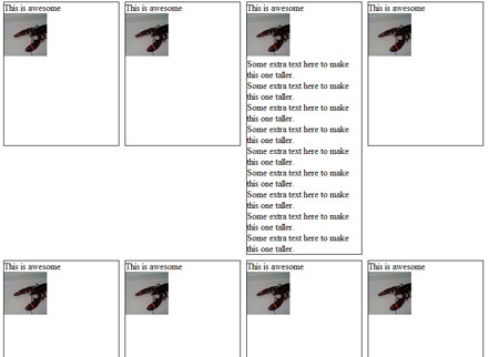
inline-block-ie7

Phew! Almost done. Just IE 6 left:

inline-block-ie6

IE 6 doesn’t support min-height, but thanks to its improper handling of the height property, we can use that instead. Setting _height (IE6 underscore hack) to 250px will give all <li>s a height of 250px, and if their content is bigger than that, they will expand to fit. All other browsers will ignore _height.

So after all that work, here’s the final CSS and HTML:

<style>
    li {
        width: 200px;
        min-height: 250px;
        border: 1px solid #000;
        display: -moz-inline-stack;
        display: inline-block;
        vertical-align: top;
        margin: 5px;
        zoom: 1;
        *display: inline;
        _height: 250px;
    }
</style>

<li>
        <div>
            <h4>This is awesome</h4>
            <img src="http://farm4.static.flickr.com/3623/3279671785_d1f2e665b6_s.jpg"
            alt="lobster" width="75" height="75"/>
        </div>
</li>

94 responses

  1. Dustin Diaz wrote on :

    Cool. Have you checked out Google’s “setInlineBlock” method?
    http://code.google.com/p/doctype/source/browse/trunk/goog/style/style.js#685

  2. abu wrote on :

    @fluidByte
    <>

    Yep, exactly, an extra class with clear:left applied to every first item in the rows would have do the trick with no pain.

    One could argue that applying an extra class every n items could be unpratical or even unfeasible in some cms scenario, but I’d like to point out that you still need it for setting the margins exactly as in the photoshop comp.
    The second screenshot has an extra margin on the right of the rows, due to the fact that every list item box in the grid has the same margin values.

    Anyway, even if the example chosen was not the best hook to introduce this inline-block trick, I really dug the tutorial, it’s something valuble to keep at hand.

  3. Kean wrote on :

    Wow, such a big breakthrough. Why did you not mention this as a replacement for the extremely hacky centered floats???

  4. James wrote on :

    Obligatory:

    http://giveupandusetables.com/

  5. c. wrote on :

    A traditional image gallery IS tabular data. This instance might only have 2 items, but it is still relational. In proper relationship database design, there are many instances where you would have only 2 columns (an ID and a name for a category, for instance), why should an image gallery be any different?

    Think outside the table. You’re willing to bend the laws of physics to make CSS turn a bunch of divs (or whatever your element of choice is), but you can’t think to do the same thing to turn table rows to do the same thing? Yes, a table can be made to look like that screenshot above. Maybe not in every version of IE, but it can still be done. It’s more important to have the proper markup than to have the proper appearance for browsers who can’t keep up.

    @Austin King Says:

    > Table vs List markup: If you have the requirement that items dynamically appear and disappear (inplace editing, drag n drop, or realtime updates) then this solution would be a much better fit than a Table based layout, as you would have to do a lot of DOM manipulations as items entered and left the page.

    And you don’t have to do this with lists? You’re joking, right? Just because sorting lists is all the rage these days and getting code to do it is relatively easy, that doesn’t mean it can’t be done with tables as well. In fact, here’s a nice example for you:

    http://www.isocra.com/2007/07/dragging-and-dropping-table-rows-in-javascript/

    Regardless, this code has merit, even if it was applied to the wrong HTML elements for the chosen content.

  6. Heath Huffman wrote on :

    As the owner and developer of an online website building tool, I have to agree with a lot of other peeps on this post – this is way to much work for something that works just fine with tables.

    The whole debate about tables only being used for data is blurry at best (aren’t images data?), and using tables is W3C compliant and completely valid XHTML/HTML and CSS. Plus, it’s not a hack and won’t break (or shouldn’t break) with future versions of all the major browsers.

    My experience has shown me that users of or website builder and their readers could care less.

    Why beat yourself up for nothing? Just use tables….

  7. Miro wrote on :

    What about this? You get the same effect with no effort

    /* Firefox */
    .class {display: table-cell;}

    /* IE */
    .class {display: inline-block;}

    PS: don’t use this method for input tags, they become invisible in Opera

  8. Cel wrote on :

    I, too, ran into this problem, but I gave up much quicker than this.

    Truly, designing for the masses (and the browsers) is not for the faint-hearted.

  9. Matchu wrote on :

    The reason not to use tables here is that perhaps we have a fluid-width situation. If we want this content to expand across the entire screen space available, but only that far, this is the best solution 🙂

  10. gcyrillus wrote on :

    hello , just very happy to see this article , a few month ago i offered this solution on a french forum (i’m french myself) to the exact same problem …
    Well just looks like english community is much more open minded and gets it easily.

    But , do not use : -moz-inline-box for FF2 and lower ,
    -moz-inline-stack is just fine , the extra element needed to fixe stacking/sizing is as well can be useful in IE useful to hold some differences , like white-space …. (ex:yidille.free.fr/plux/valign/uploads/centre-inline-stack.html)
    even then , some backgrounds bugs issue may appear , so this inline-stack element should be used as less as possible to hold the design of a page …

    Inline-block is used to fixe layout ‘attitude’ , as well in FF>2(or else) than IE .(to hold floatting elements for instance) .

    To provoque : display:inline-block; in IE 7 and less , on blocks element and behave like else where , you need : display:inline; + zoom:1; through conditionnal Comments .

    FF2 will soon not matter anymore , but IE 7 will survive for a while , so be glad to use Conditionnal Comments , you may drop -moz-inline-stack; workaround 🙂 .

    GCyrillus

  11. gcyrillus wrote on :

    oups,
    of course , we all understand that the point here , is not to kill tables , but to have a more efficient use of css … More you know , easier it is to choose a good option .
    that’s all folks , no troll inside
    thanks !

  12. dtorres wrote on :

    Using your example, what can we do if we want to center horizontally & vertically the images shown in the layout? Because of all the stuff applied to hack between browsers, now any align property used in the inside div doesn’t work… at least in ie7||ff3

  13. GT wrote on :

    Hi,

    Great fix – it really helped me out today.

    I go along with the “use tables” argument to a certain extent. However, tables aren’t option for me as I’m using it in our CMS that uses ULs and LIs in the menu in a standard way across sites and I want to style it a number of different ways depending on the client and layout requirements.

    Anyway, thanks.

    Cheers

    G.

  14. dydi nadya wrote on :

    hello all.
    am not sure if this the rite place to ask about my probe.
    is anybody out there use this cross-browser inline block in wordpress-mu forntpage?

    i try to use it, but when i call the wp_content() function, it displays the same text in each of my block.meanwhile i try to display differ text for differ block.
    what should i do?and another this is i want each of the block’s content can be added from the admin panel..
    is anyone solve this kind of probe.pls help me.am a noob in this wordpress-mu and cross-browser. i try to get some help from wordpressmu forum..but no one seems to give me detail explaination..any help much appreciated..

  15. Major karthik wrote on :

    Great effort, but it shows errors when I validate in w3c

  16. Kevin Rapley wrote on :

    This is a complete oxymoron if ever I have seen one. This is a table, you can code it in a table with a caption at the top, layout with th’s and td’s and you eliminate all of this nonsense and ridiculous hacks. By the way as written by Tantek Celik widely that * hack is not forward thinking. The semantics of this are completely shot and I warn everyone to stay well clear and implement a sematic table for this type of content. Table’s were built for this purpose.

  17. Roark wrote on :

    Great post,

    Thanks for the insite!

    Just wanted to say to all the “anal retentive” people giving comments about the layout being tabular data:

    If this layout is fluid, which I’m guessing it is, when you view the site on a wider resolution screen, the above example will shift the blocks around allowing for any number of blocks per-line. This is not possible with tables, you have to specify the number of blocks/cells and stick to it.

    SO… think before you post.

    Also

  18. David wrote on :

    One solution I found to this that maybe isn’t quite as reliable but a lot shorter is to use “display: inline-block” in the CSS, then a server-side variable that on detecting IE inserts the code “style=’display: inline'” into the HTML for the element.

    This results in the display being corrected in these browsers, but will only work when added to the HTML as a style= declaration and does not work from the CSS file.

  19. Trevor Norris wrote on :

    For those complaining about W3C CSS validation, rethink what it takes to get the job done. In their new site beta even W3C uses the IE “_” hack to get everything working. When the browser doesn’t support compliant code, it’s impossible to code compliantly.

    The so overlooked usefulness of using in place of the in a situation such as this is that IT’S DYNAMIC. A table is set and unmovable, while the use of this method allows the content to flow with the window size. If the window is large enough there may be 8 or 10 elements shown, where a small screen will only show 4 or 5. For anyone that cares about the viewers of their page, this is a definite benefit.

    I only use tables when there are give a set number of columns. Floating around an address list would be absurd, but this was an excellent example of when and how to use the dynamic capabilities of CSS to extend flexibility of your website.

  20. a hassan wrote on :

    everything works fine on every browser in the universe except for fucking shitty microsoft internet explorer.

    i’ve tried many things to fix the inline-block problem with ie and nothing works – including this article and many others.

  21. Alex wrote on :

    This is not a tabular presentation at all. You can’t have sequential cells in a table and expect it to be usable at all.

    Example:
    A | B | C
    D | E | F
    G | H | I
    This not a usable/accessible table. What would the required header fields be labeled? “In this column, we have items A, D, & G.”

    To represent the data as a table, you need to normalize the data into columns or rows.

    If by rows, each item would be a row. Each item property (thumbnail, title, description) would be columns. As follows.
    item | thumbnail | title | description
    item A |
    item B |
    item C |

    If by columns, each item would be a column. Each item property would be rows. As follows.
    property | item A | item B | item C
    thumbnail |
    title |
    description |

    So, you could represent that information in tabular format, but not as depicted in the original design. That requires a list (e.g., ul/ol & li) or just sequential elements (e.g., div).

    -AH

  22. BoonDog wrote on :

    I still can’t believe that people push tables for this sort of issue… I guess your all still manually typing in every piece of data, using inline page styles to change text colour and size instead of proper markup… using WYSIWYG editors like frontpage to bloat there code…

    Think about real world website, where the content is dynamic… instead of the image taking up one ‘cell’ it takes up 2, then one then 3 then 1 then 3 then 1 then 2. How much fun are you going to have trying to use colspan to keep your tables in line.

    Tables should only be used for presenting tabular data… not for layout issues like this and Alex has nailed it on the head with his expination of this. I think that most of the ‘hacks’ here can be handled using compliant code as described above using conditional statements that should then be moved out into browser specific stylesheets so that they don’t require lads on compliant browsers. A combination of SPAN (ie allows in-line block on these elements) and divs will easily handle this design. Good break down article, that gives you a good direction on what to look out for…

  23. Frug wrote on :

    A really great article as far as clarity and usefulness is concerned. Still, if I was working on a project that needed to get done, I would probably just use a table.

    For all the talk of “it’s not semantically correct” and “it’s not tabular data” yes, sure. But browser workarounds left and right are not much better. You would rather shove browser hacks into your code, and I would rather forget about whether the data is “tabular” because it makes no difference to the end user in 99% of cases.

    PS the example given in the article doesn’t give sequential elements. If the project in question does have sequential elements then yes, an OL might be worth thinking about (funny you suggest a UL for sequential data 😛 )

  24. Tim Franklin wrote on :

    Thanks for the great article! I had just launched a new design on my blog and forgot I had upgraded to IE 8 at home.

    When I got to work none of my inline-block elements looked right because we are required to stay on IE 7 for now. This was a great quick fix.

    I know better than to launch something without doing browser version checking (I already had checked the latest versions of IE, FF, and SF) but must have been up too late at night. Doh.

  25. Matt wrote on :

    Its interesting to see hwo people think anything
    ‘grid-like’
    is a
    ‘table’.

    A dynamic table would usually add more rows at the end of the table, and the number of columns is always set. Or far less commonly the other way round.
    This means if you want to add a new element, then you add it as a new row after the last row (or possibly insert it in between some).
    Here the rows are made up of a number of boxes, BUT the number of boxes in a row isn’t set (that is dynamic), which means it’s not necessarily tabular.
    Also, a new element we want to insert here is just a box. A box isn’t a new row, it is part of a row. Again, not looking like a table.
    Only when the number of boxes in a row is set, then the data becomes tabular.

    Here, the data is actually a list of boxes, which are displayed in-line, on multiple lines. the width of the boxes on a line determines how many can fit on one line before the rest are put on the next line and so on. This is a much more flexible format, and one that should be implemented with CSS.

    You can think of the boxes as words in a sentence. In a text editor, you write your sentence, going to the next line as you run out of space for the next word [/box]. Thanks to computers, if you then insert a word in your sentence on your top line, it will usually shove all the succeeding words along and over to the next line.
    A sentence is a list of words, usually put on multiple lines for easy-to-readness. This is exactly what the box structure is in this blog.

  26. Simon wrote on :

    Table junkies, just resize your browser window. With this solution you can have a fluid design. With a table you get scrollbars…

  27. Kent wrote on :

    Ditto to Matt. More to the point is that “tabular data” is data for which the meaning of each chunk is dependent on the intersection of the row / column in which it appears; a database table is a great example. The grid structure doesn’t define it as tabular data. It’s the other way around: the most convenient visual representation of tabular data is a grid structure.

    A group of pictures is just a group of pictures. Order may be important, but in this case it doesn’t appear that the meaning of the pictures depends on the row / column in which they fall.

    Thanks for helping lead the way toward getting grids without tables. Browser authors will not bother to improve their software if the demand isn’t there, and figuring out tricks like this makes it easier for the rest of us to reach the ideal rather than giving for the sake of convenience.

    Besides all that purism, there’s the practical matter of re-using markup for different layouts under different circumstances by changing only the CSS. That ability is pretty valuable in my book.

  28. ctoicqtao wrote on :

    I don’t want use zoom:1 & *display:inline in IE6&IE7. Do anyone know how to do? GOOGLE did it!

  29. alex wrote on :

    Great article. Saved my skin when trying to horizontally centre some floated list items in an unordered list. Converted to inline-block and it’s too easy!

  30. Spendicus wrote on :

    Sorry, but with all of the various browsers / versions and the lack of consistent CSS support tables make more sense on things like this. The argument about “what if the boss decides that …” is null and void. There should already be an understanding in place that some things should be decided BEFORE coding begins. If that is not possible or there are last minute changes (very common) use quick mock-ups or comps to get an agreement and then go adjust the table. Changes that happen like this are simply going to take time – plain and simple. That is what we get paid to do. I hope that one day all of the browsers will render everything the same and there will be 1 set of standards that they all adhere perfectly to. I’ll then be able to take a vacation.

  31. Jason S wrote on :

    Fantastic, this saved me from reverting to tables! Thank you!

  32. Juarez P. A. Filho wrote on :

    Finally I found a great explanation and the best solution. Thanks a lot.

  33. Adam wrote on :

    Great solution… however, maybe there should have been a different way of looking at this problem rather than trying to solve the problem in hand….

    Let’s take XP and vista as examples of how they handle the same situation as yourself, via their “Thumbnail” view of files.
    If the file name is longer than a certain name, they cut it off with “…” (you’ll see it in Vista most visibly).

    So given that you already show a thumbnail picture (giving a fairly good idea of what people might click on), why not just do a check on the “title” and “by” text to cut them off at a certain length so you know they will never include any more than x number of characters. Wrap them in a span and then put the title of “title – by” in it so when they hover it shows the full description?

    That way you can go back to your great float method and jus set the height to be in em so it only takes into account the resize of text and in which case, all heights would resize the same too.

    Maybe that’s just a far easier way of solving a problem?
    I mean, let’s face it, your design shouldn’t have to take into account the fact that the text might contain in between 50 characters and 1000 characters. You have to draw a line on what is expected.

    Even with your solution, why on earth would anyone except the visual layout of that to look nice if you have one block that is excessivly higher than another??

    But sure, your solution solves it.
    Tables are for designers that simple don’t understand the difference between data and layout, but then, if the browsers let it be and nobody with a screen reader complains… what the hell aye? 🙂

  34. Ben wrote on :

    Yeah baby! Thanks for this great post, this is the ideal solution for a new website projekt of mine! THANKS a lot.

  35. Russ wrote on :

    Tabular Data!!!
    Tabular Data?!?
    Tabular Data??????

    What are you going on about, this is NOT tabular data.

    Go and read more on tables and you ‘may’ just learn a little more.

    And in response to what the other amateur said – You go and run circles around me and make quick pages. I’ll continue to make the great pages I make….and “Oh Wait for it” (as you monkeys say!) When it’s time to update or add information to my page…I’ll run circles around YOU!.

    I like this… It’s definitely a better solution to using tables for NON-TABULAR data…

  36. mike funk wrote on :

    uh this is ok and all, good to know, but you can easily do this by just wrapping every 4 items in a div, clearing the float with the wrapper, and floating each element left. of course that only works in a fixed width layout but most are fixed width nowadays anyway.

  37. Anders wrote on :

    Is the haslayout trigger really necessary here? I’m getting the exact same result by feeding only display: inline to IE 7 and below.

  38. Bradford Sherrill wrote on :

    Great Post

  39. paolo wrote on :

    thinking ‘square’ is just like seeing a straight road and design your car without a steering wheel.

    The fact is:
    1) with db-driven data you have to deal with empty slots;
    2) sooner or later you might need to make it more complex;
    3) coding a table requires more markup and slows the downloading down;
    4) mobile apps might not be rendering table markup the proper way;
    5) never thought about people who need screen readers? just try yourself and say: this is a list of images AND this is a table in which we have images in rows and images in columns.

    However, I don’t regret using fixing heights and widths, since non-consistent data entry might lead the interface to look quite bad.

  40. Sean Curtis wrote on :

    Paolo is right – for all you idiots saying to use tables what do you say to your boss/client when they want a mobile version of the page created? Are you going to suggest a bit of user agent sniffing and redirect them to a page with only one image/caption per TR?

    Using CSS and a list is the RIGHT way to do this. I don’t agree with having the hacks in the main stylesheet, move them to a conditional stylesheets instead.

  41. Liam wrote on :

    Those saying use a table because it’s tabular data. Well, do any of you understand what tabular data is? It’s not something that lines up in a grid, it’s data, which is best displayed in a table. The type of data you’d use a spreadsheet program to create and edit.

  42. TableTopDancer wrote on :

    Well this is a long *** thread. But I have an issure with this display inline-block. and need a good answer please.

    layout is like this:


    How do I get divs 2 and 3 to line up next to each other. I don’t want to use float or table. Tried everything to get it to work , got it once and then decided to tidy up the code and God knows what i deleted but the solution is evading me now.

  43. vol7ron wrote on :

    I haven’t tested the zoom:1 yet, but there is another IE6 hack:

    . {
    display: inline-block; // FF+
    }
    . {
    *display: inline; // IE5.5+
    }

    It’s basically the same thing, forcing a new instance of the class to be applied, but only for IE. — note: replace . with your class, ID, or element (e.g. .active {}, div{}, #elementID {}

  44. supahank wrote on :

    I put this method to use on a site that has several different grid layouts going on, and it works great except for one thing. I’m hoping someone reading this can help. In one of the grid layouts, the first few li’s have a background-color set, to indicate that they are ‘active’. The design calls for there to be *no* space between the li’s, so that the background-color is seamless. But using this css method, there is a mystery 5px right margin on every li. I’ve gotten rid of all css margins and padding on the li’s, and it’s still a complete enigma. Anybody else run into this? I’m seeing this in FF 3.0 & 3.5, IE8 (not 6 or 7), and Safari. So the ‘inline-block’ tacks a phantom 5px margin on block-level elements. You can see my test here: http://www.lesliesommer.com/tests/grid.html

More comments: 1 2